An audio app for OLP Art Museum meant to provide supplemental educational materials for students, art enthusiasts, and lifelong learners
Patrons of the OLP Art Museum currently do not have an app to help organize aspects of their museum experience.
Create an app for museum patrons. The app should allow users to learn about the art through sound without requiring a guided tour or museum-specific audio device. The app should also help in logistical tasks associated with visiting the museum, such as ticket purchases.
UX/UI designer, UX researcher: responsiblities included user research, wireframing, usability studies, mockups, and prototyping.
I conducted interviews with art museum visitors in order to better understand their needs.
Detailed background information about art is often missing, especially for those unfamiliar with different types of work.
Art museums can sometimes be noisy or crowded, preventing individuals from being able to focus specific pieces of art.
Text descriptions placed next to works of art are sometimes difficult to read.

Srijana spends her days juggling her time between being a small business owner and looking after her 3 kids. She likes taking her kids to her local art museum, but often doesn’t have time to find supplemental educational materials for them, especially since her youngest daughter needs visual aids.

Carl is an engineer who wants to explore new interests as he approaches retirement. He likes to visit museums, but dislikes the noise and crowds. Because of his work schedule, he can only visit museums for two hours on the weekend, when they are the most busy.
I analyzed the overall aesthetics, historical content, and age range accessibility of competitors. All current apps require users to spend time reading rather than focusing on the artwork.
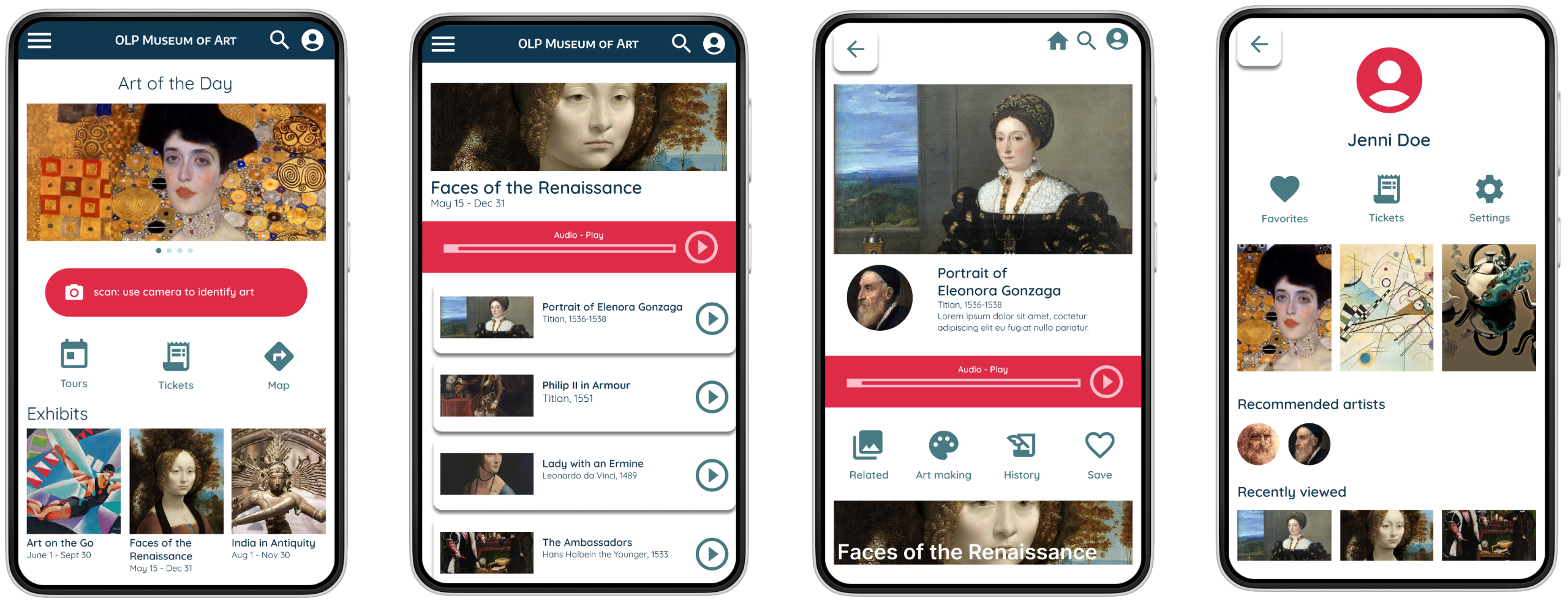
My goal was to create a reasonable balance of visual elements (artwork) while always keeping the audio function front and center.
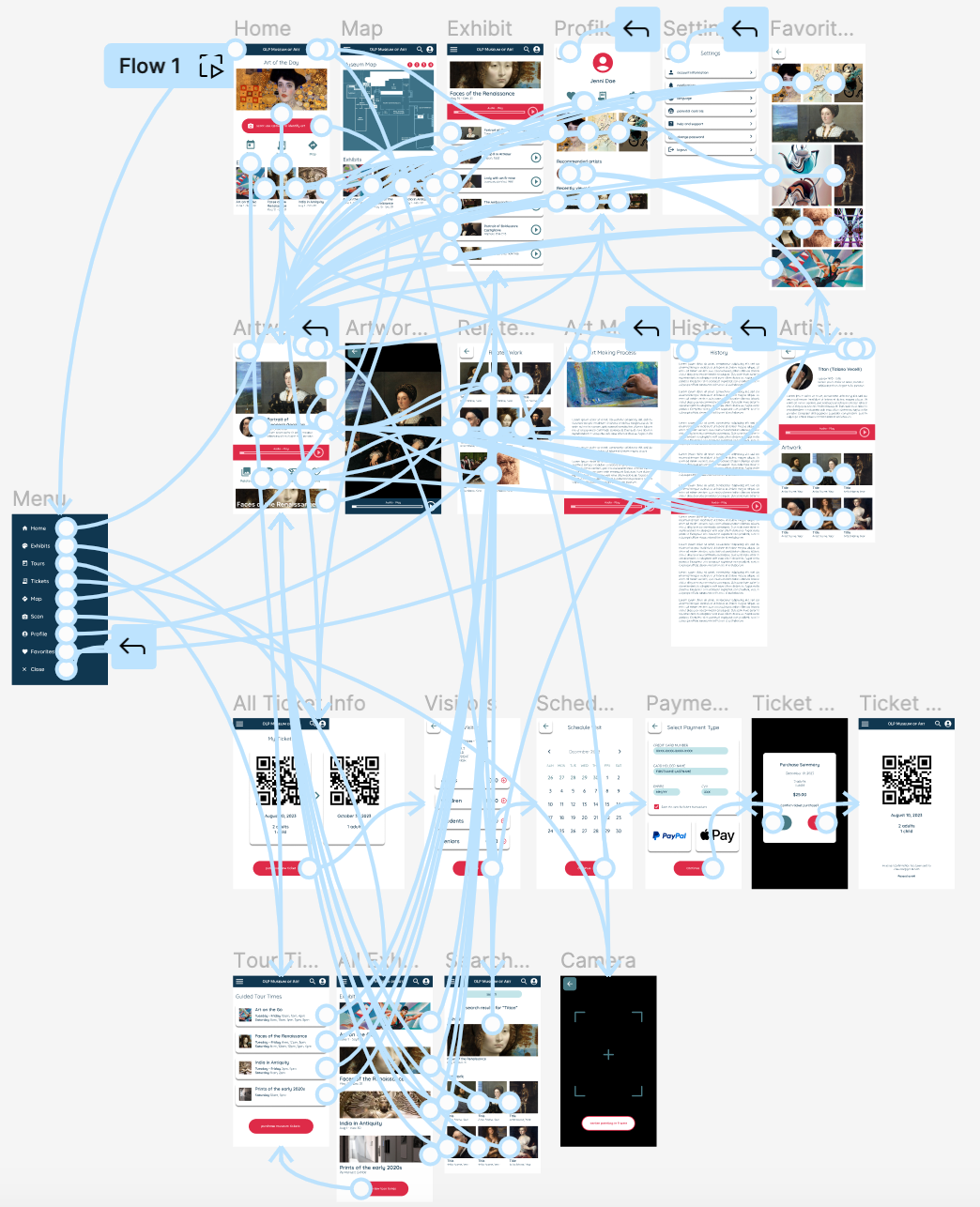
I wanted to allow users to have multiple ways to find what they are looking for.
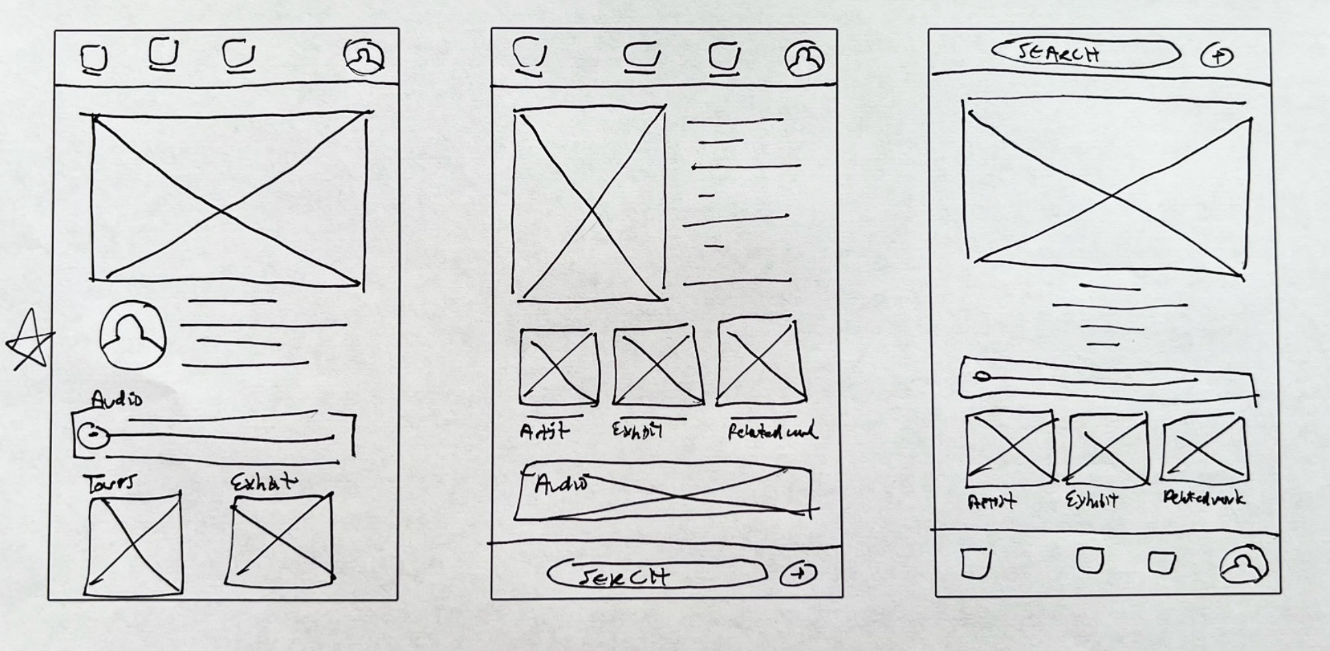
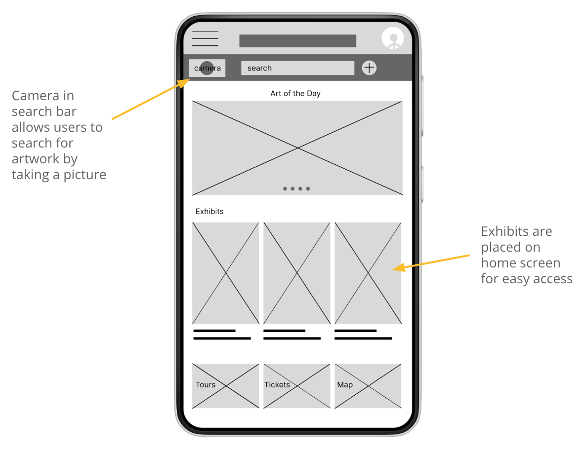
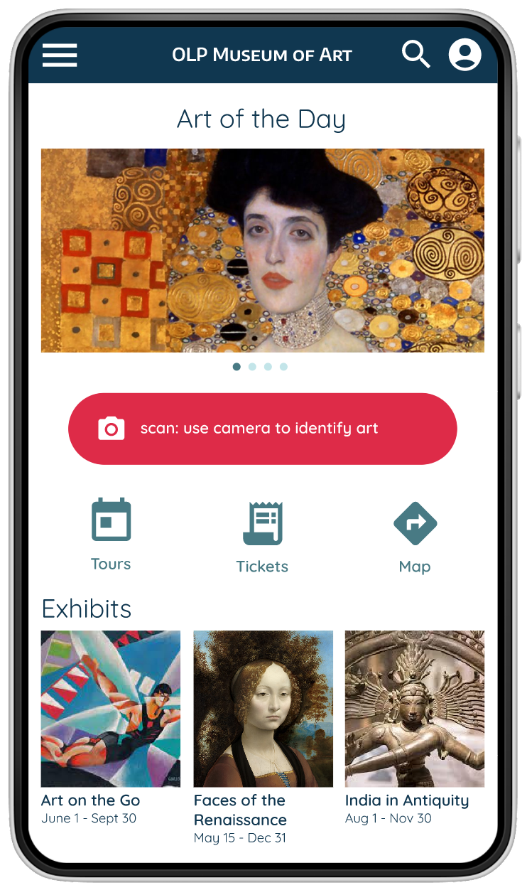
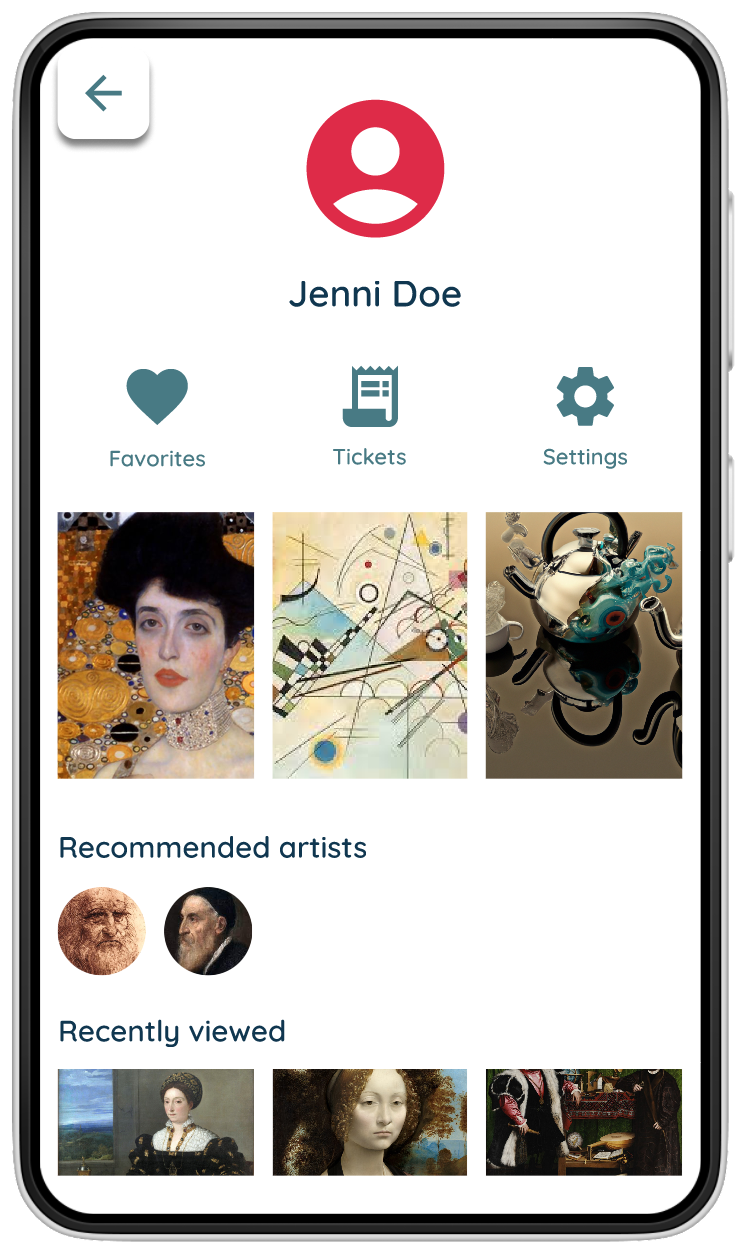
From the homepage, users have multiple options of how to select what type of art they want to learn about.
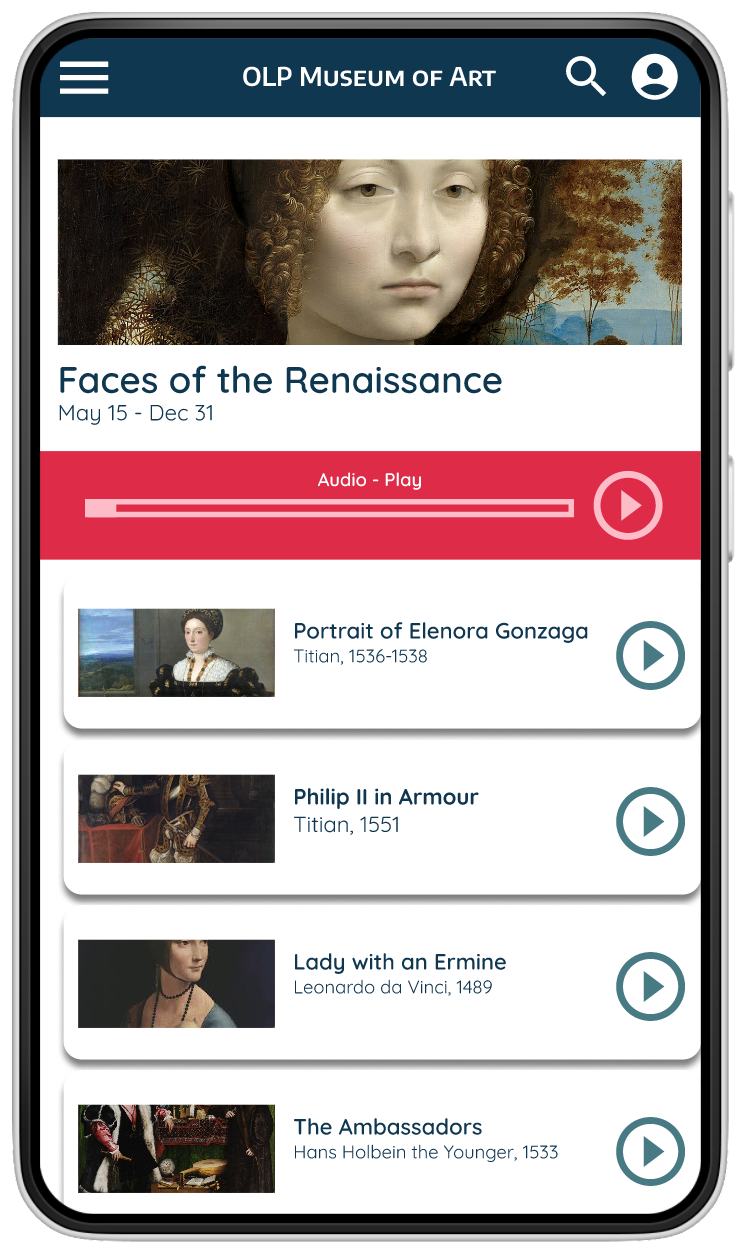
Users have access to structured audio tour, but can also easily choose which art to learn about in any order.
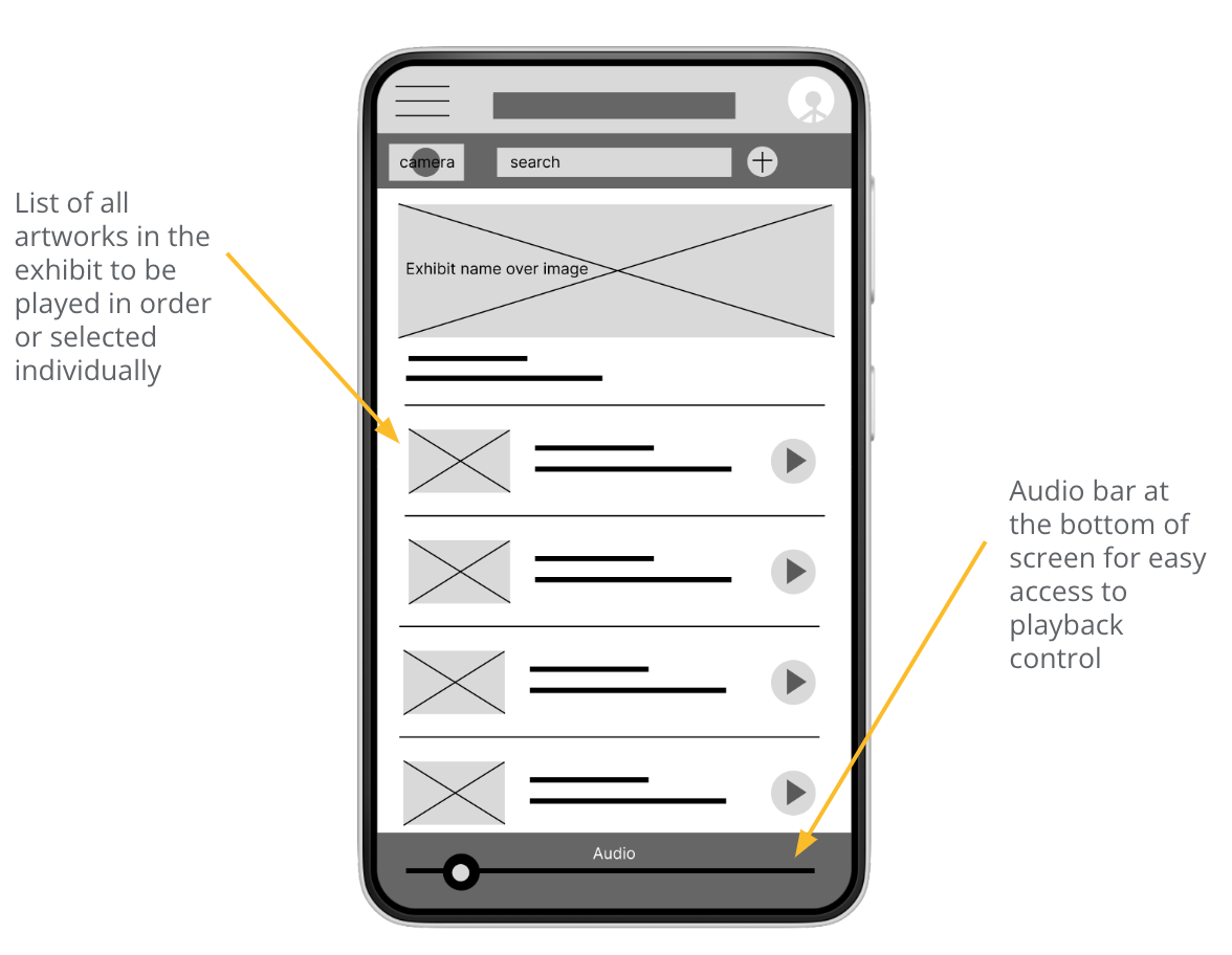
The user flow is focused on easily allowing users to access information about individual pieces of art and relevant information.
Prototype was created using Figma.
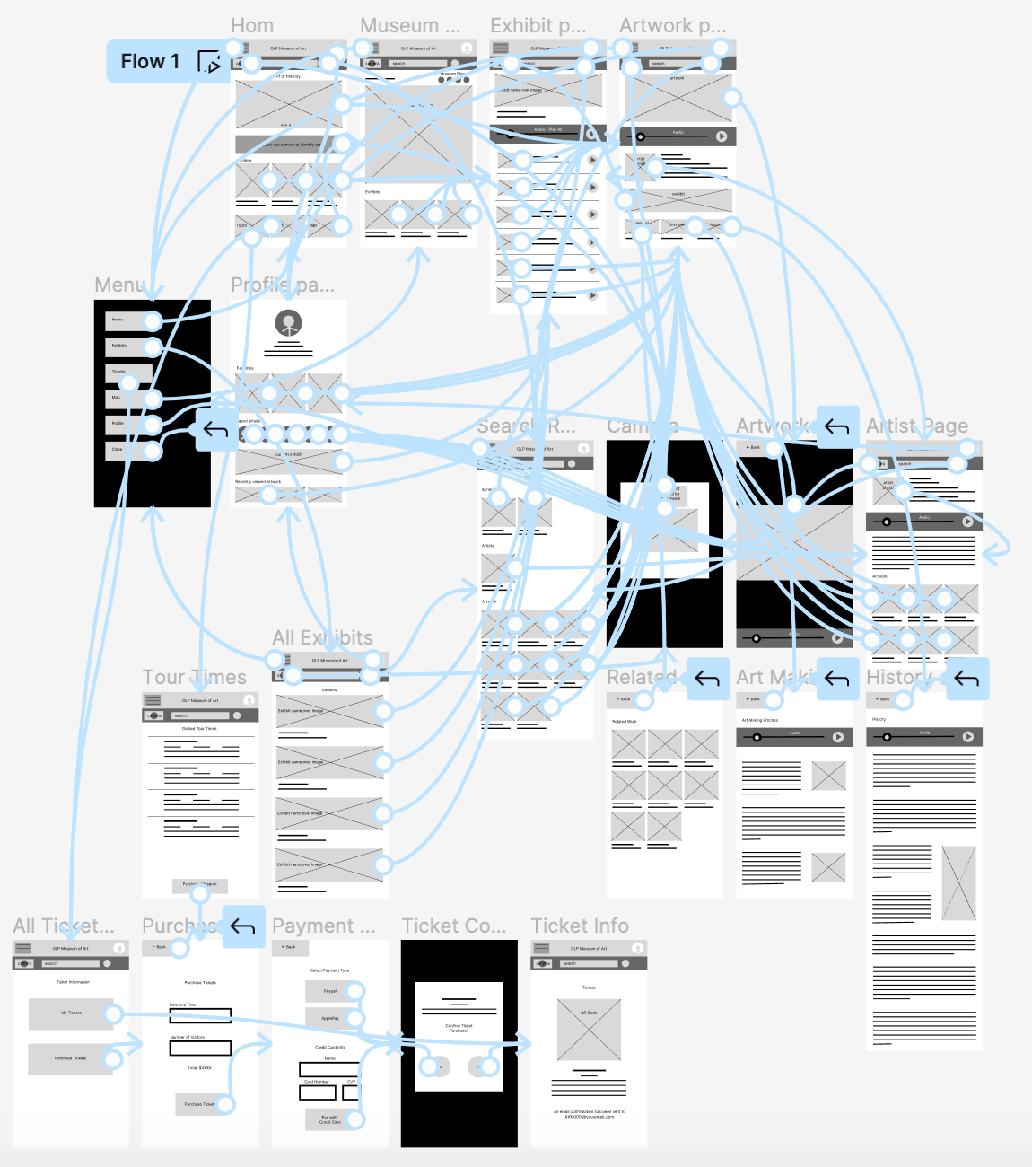
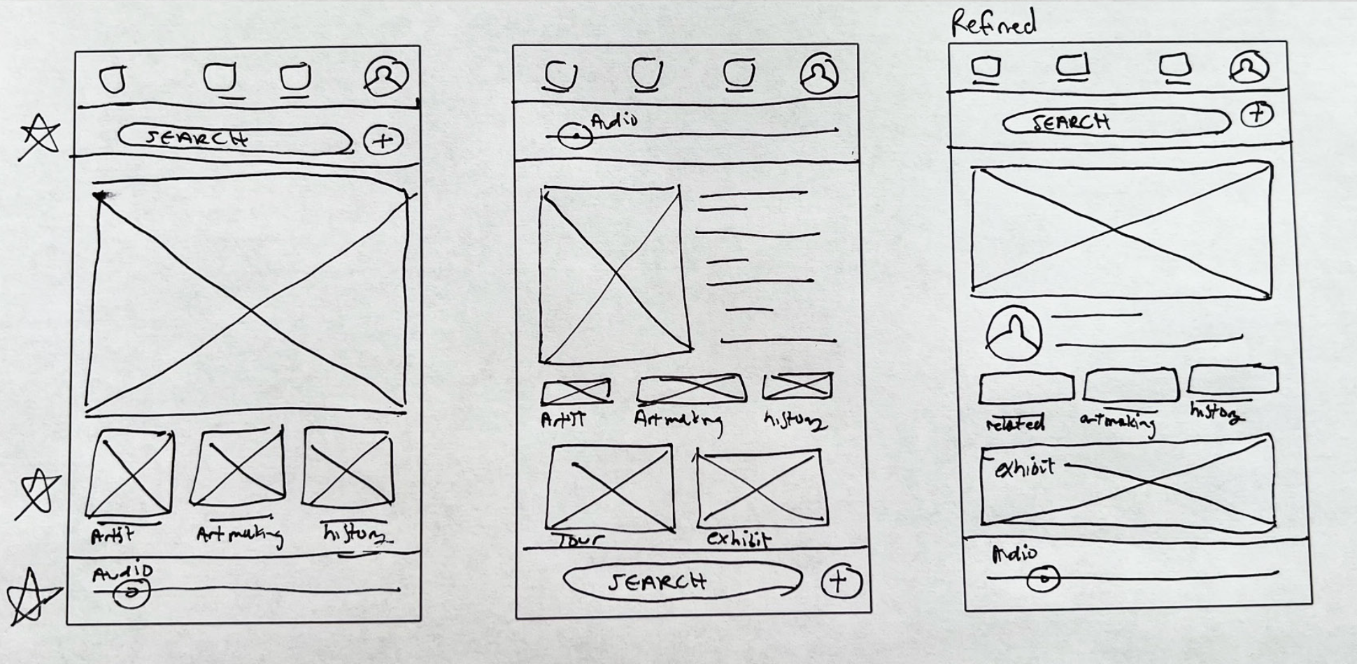
I conducted two online usability studies in order to get feedback on the overall user flow of the app.
1. Users want multiple payment options
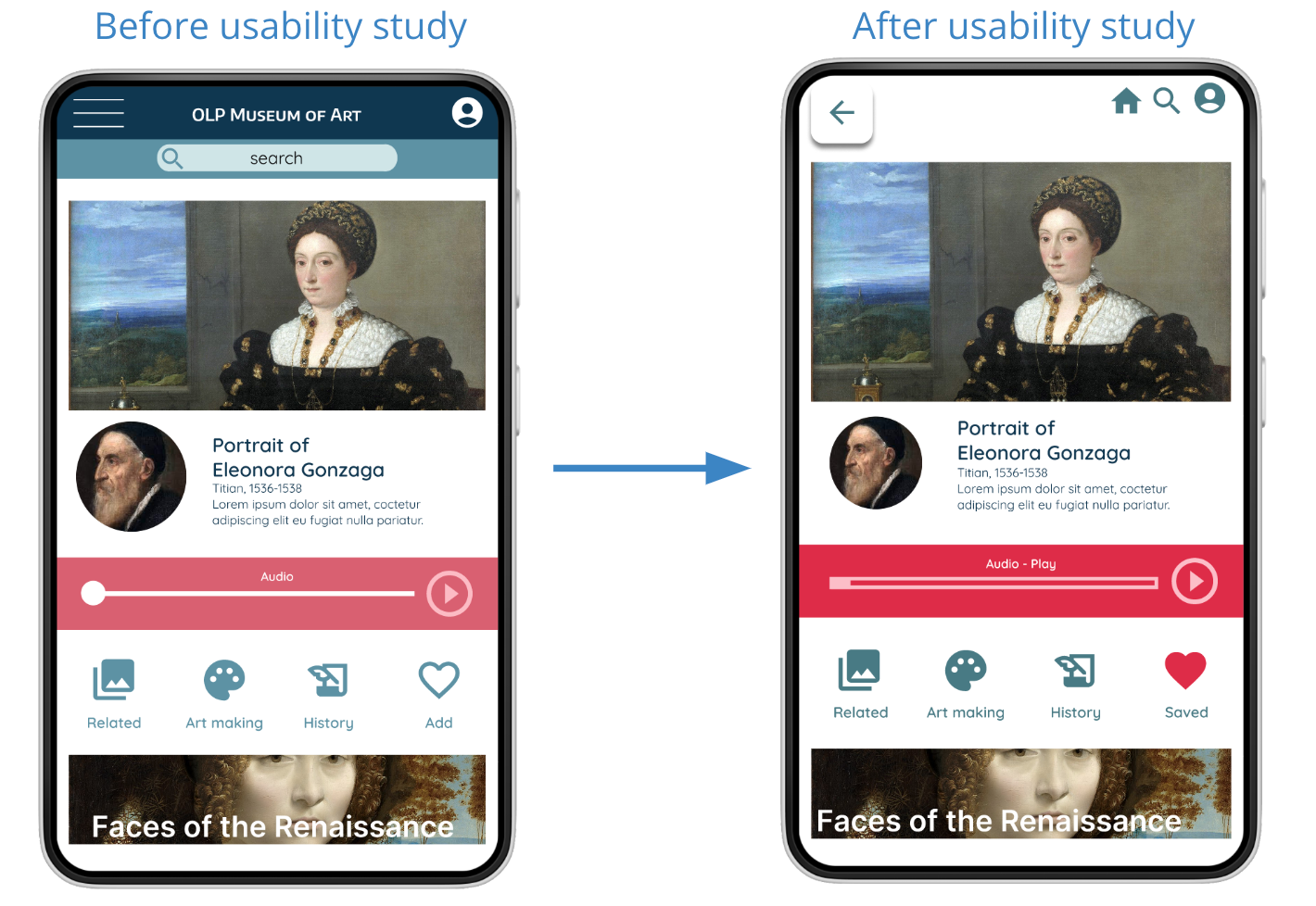
2. Users want an audio feature
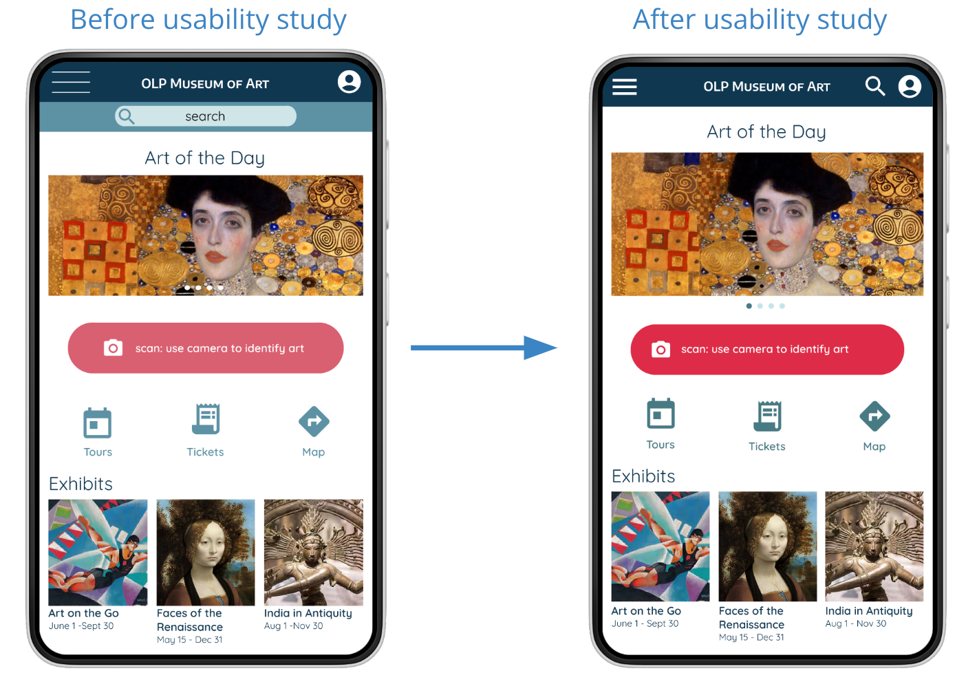
3. Users want camera feature to be clear and accessible
1. Users want direct navigation between specific pages
2. Users want simplified search results
Based on feedback from usability studies, colors were given increased contrast in order to assure visual accessibility. The search bar was changed to an icon.
The header bar and hidden menu were replaced with back button and select icons (home, search, profile).
1. All educational content within the app is available in both text and audio forms, allowing many different types of users access.
2. Multiple options are provided to navigate to important pages and information.
3. Background and text colors have high contrast in order to make reading easy even in low-visibility conditions.
Museum patrons reacted positively to the aesthetics and navigation of the app:
"[The app navigation] was easy, and I'm not good at this so if it was easy for me it will be easy for anybody."
"Almost every page I was on was a lot of pictures of art which was very satisfying."
This was my first time designing an app. While I had previous experience in UX research, this was my first time engaging in UX research and usability testing for a consumer product. This project also allowed me to become acquainted with prototyping in Figma.
1. Create a version of the app that includes a wider variety of art images, audio, and written content to insure that the app layout allows all types of material to be displayed clearly.
2. Run a usability study for the fully implemented audio features.
3. Observe reactions to app post launch to determine if any features need to be altered or added.
Copyright ©. All Rights Reserved. — Website template designed by Untree.co Distributed By ThemeWagon